All the Colors of the Internet
WordPress DC, August 2016
Photo by dhester at Morguefile.com
How do humans see color?
How do humans see color?
Humans don't see the same colors as one another because color is not a physical property of objects.
How do humans see color?
Color is a psychophysical property.
Color perception is the result of the spectrum of wavelengths reflected by a given object reaching our eyes, the response of the photoreceptors in our eyes, and the interpretation of that response by our brains.
How do humans see color?
Rods
All rods:
- contain one photoreceptor
- have the same sensitivity to wavelengths
- respond to low light levels
How do humans see color?
Cones
Humans have three types of cones:
- short-wavelength ("blue")
- medium-wavelength ("green")
- long-wavelength ("red")
How do humans see color?
Trichromatic Color Theory
Our visual system is defined by numbers that correspond to the proportional outputs of the three photoreceptor types.
Photo by Fir0002/Flagstaffotos via Wikipedia.com
Photo by AcrylicArtist at Morguefile.com
Color Theory
What about red, yellow, and blue?
Color Theory: Subtractive Synthesis
Opaque objects reflect all or part of the light they receive.
Color Theory: Subtractive Synthesis
If an object absorbs all light...
Photo by o0o0xmods0o0o at Morguefile.com
Color Theory: Subtractive Synthesis
If an object reflects all light...
Photo by BrandonMenth at Morguefile.com
Color Theory: Subtractive Synthesis
If an object absorbs absorbs blue and green wavelengths...
Photo by HizumiSakurai at Morguefile.com
Color Theory: Subtractive Synthesis
When we "mix" paint colors, we are mixing opaque pigments, not light.
Color Theory: Subtractive Synthesis
Pigment Colors
Primaries
-
Cyan
-
Magenta
-
Yellow
Secondaries
-
Red
-
Green
-
Blue
Color Theory: Additive Synthesis
When we "mix" light colors, we are combining wavelengths of light.
Color Theory: Additive Synthesis
Mixing pigment colors and light colors have opposite effects.
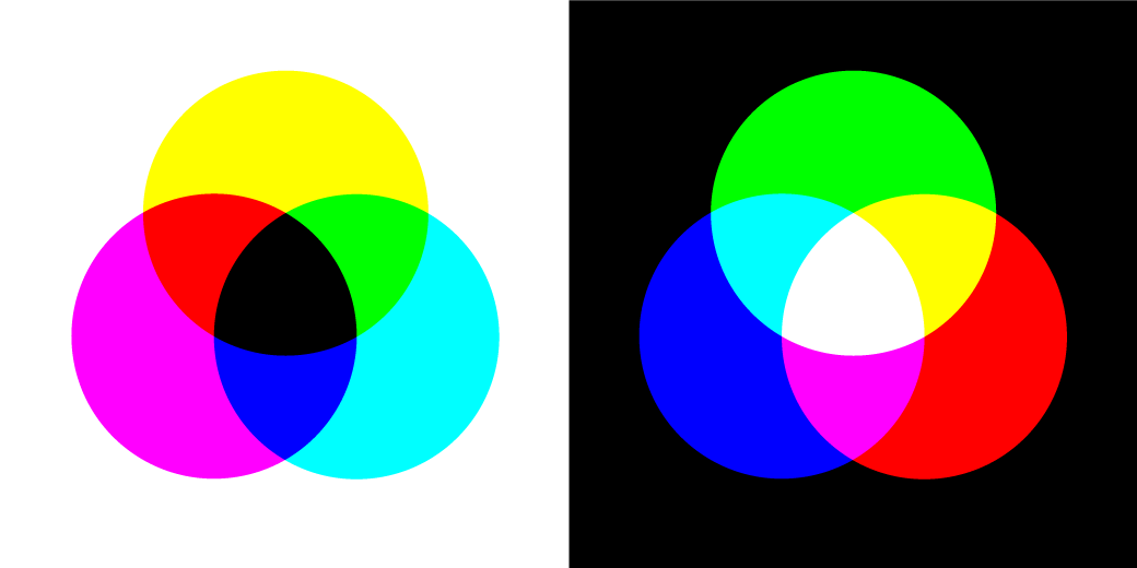
Color Theory: Additive Synthesis
Light Colors
Primaries
-
Red
-
Green
-
Blue
Secondaries
-
Cyan
-
Magenta
-
Yellow
Web designers tend to work with subtractive color palettes because these mirror the natural world that we live in.
Computers generate color using additive systems.
Screen-Based Color Models
Web Safe Colors
216 colors were identified as "web safe" at the time when computer monitors were limited to 256 colors.
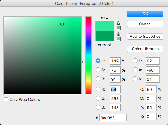
Screen-Based Color Models: Hex
Hex Colors
Format
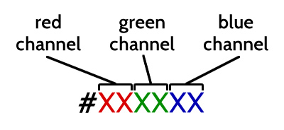
Screen-Based Color Models: Hex
Hex Colors
Values
- Each digit can range from 0 to f, with 0 being the lowest value, and f being the highest value.
- 16.7 million potential combinations
Screen-Based Color Models: Hex
-
#000000
-
#000011
-
#000022
-
#000033
-
#000044
-
#000055
-
#000066
-
#000077
-
#000088
-
#000099
-
#0000AA
-
#0000BB
-
#0000CC
-
#0000DD
-
#0000EE
-
#0000FF
Screen-Based Color Models: RGB
RGB Colors
Format
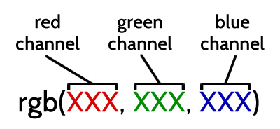
Screen-Based Color Models: RGB
RGB Colors
Values
- Each digit can range from 0 to 255, with 0 being the lowest value, and 255 being the highest value.
- 16.7 million potential combinations
Screen-Based Color Models: RGBA
Don't forget RGBA!
Part of what makes the RGB color model awesome is the ability to add an alpha channel, which controls opacity (in IE9 and up).
Format
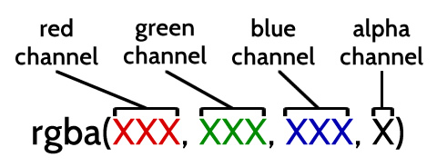
Screen-Based Color Models: RGBA
RGBA Colors
Values
- RGB values follow the same rules as regular RGB.
- Alpha values can be a value between 0 and 1 or a percentage between 0% and 100%, with 0/0% being fully transparent and 1/100% being fully opaque.
Screen-Based Color Models: RGB
-
rgb(0,0,0)
-
rgb(0,0,17)
-
rgb(0,0,34)
-
rgb(0,0,51)
-
rgb(0,0,68)
-
rgb(0,0,85)
-
rgb(0,0,102)
-
rgb(0,0,119)
-
rgb(0,0,136)
-
rgb(0,0,153)
-
rgb(0,0,170)
-
rgb(0,0,187)
-
rgb(0,0,204)
-
rgb(0,0,221)
-
rgb(0,0,238)
-
rgb(0,0,255)
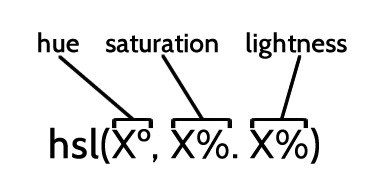
Screen-Based Color Models: HSL
HSL Colors
Format
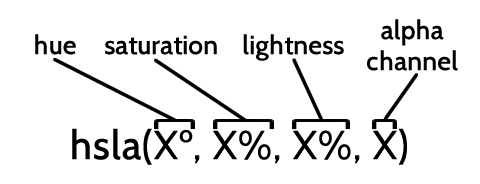
Screen-Based Color Models: HSL
HSLA Colors
Format
Screen-Based Color Models: HSL
HSL Colors
Values
- Hue: degree ranging from 0 to 360
- Saturation: percentage from 0% to 100% with 0% being fully desaturated and 100% being fully saturated
- Lightness: percentage from 0% to 100% with 0% being black and 100% being white
- Alpha Channel: value between 0 and 1 or a percentage between 0% and 100%, with 0/0% being fully transparent and 1/100% being fully opaque
Screen-Based Color Models: HSL
HSL Colors
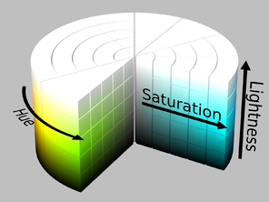
Screen-Based Color Models: HSL
HSL Colors
Saturation
Lightness
Screen-Based Color Models: HSL
HSL Colors
Print-Based Color Models
What about non-web color formats?
Print-Based Color Models
Not all screen colors can be printed and not all print colors can be displayed on a screen.
Print-Based Color Models
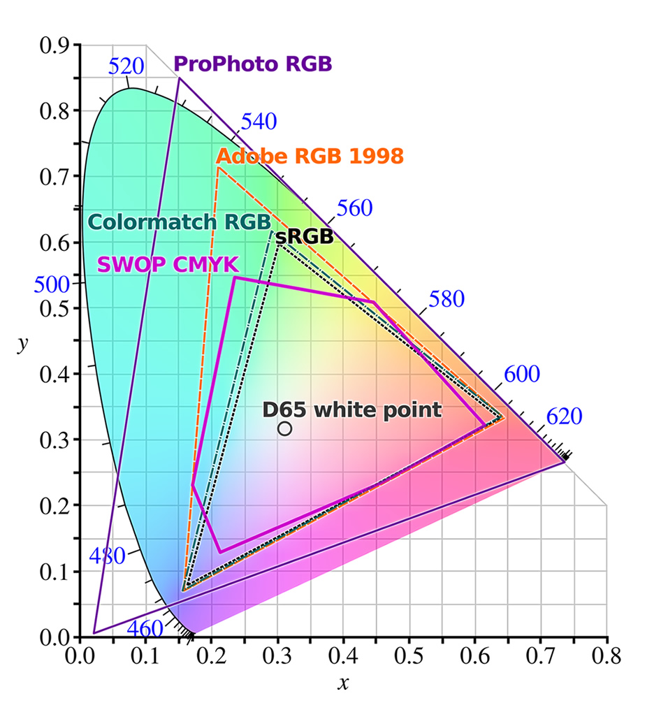
Print-Based Color Models
CMYK
CMYK printing is based off the concept of spot colors: cyan, magenta, yellow, black. Spot color values range from 0% to 100%.
Conversion Tools
- Color picker in Photoshop or Illustrator
- Online conversion tool like Rapid Tables
Print-Based Color Models
Pantone
Pantone is a proprietary color model where color mixes are generated using thirteen specific spot color pigments and black.
Conversion Tools
Web Content Accessibility Guidelines: Color
Principle 1: Perceivable
"Information and user interface components must be presentable to users in ways they can perceive."
Web Content Accessibility Guidelines: Color
Guideline 1.4: Distinguishable
"Make it easier for users to see and hear content including separating foreground from background."
Web Content Accessibility Guidelines: Color
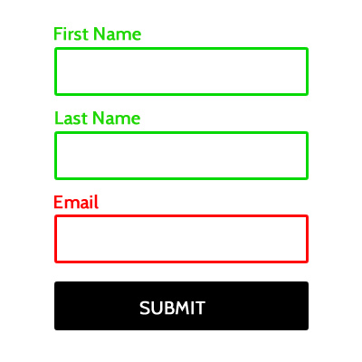
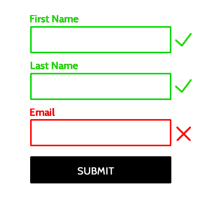
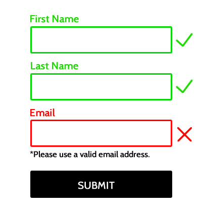
Guideline 1.4.1: Use of Color
"Color is not used as the only visual means of conveying information, indicating an action, prompting a response, or distinguishing a visual element. (Level A)"
Web Content Accessibility Guidelines: Color
Web Content Accessibility Guidelines: Color
Web Content Accessibility Guidelines: Color
Web Content Accessibility Guidelines: Color
Web Content Accessibility Guidelines: Color
Web Content Accessibility Guidelines: Color
Web Content Accessibility Guidelines: Color
Web Content Accessibility Guidelines: Color
Web Content Accessibility Guidelines: Color
Web Content Accessibility Guidelines: Contrast
Guideline 1.4.3 Contrast (Minimum)
"The visual presentation of text and images of text has a contrast ratio of at least 4.5:1, except for the following: (Level AA)"
- Large Text: "Large-scale text and images of large-scale text have a contrast ratio of at least 3:1."
- Incidental: "Text or images of text that are part of an inactive user interface component, that are pure decoration, that are not visible to anyone, or that are part of a picture that contains significant other visual content, have no contrast requirement."
- Logotypes: "Text that is part of a logo or brand name has no minimum contrast requirement."
Web Content Accessibility Guidelines: Contrast
WCAG Guideline 1.4.6 Contrast (Enhanced)
"The visual presentation of text and images of text has a contrast ratio of at least 4.5:1, except for the following: (Level AA)"
- Large Text: "Large-scale text and images of large-scale text have a contrast ratio of at least 4.5:1;"
- Incidental
- Logotypes
Web Content Accessibility Guidelines: Contrast
Normal Text
- less than 18 point (approximately 24px)
- between 14 point (approximately 18.66px) and 18 point and regular weight
Large Text
- 14 point and bold or larger
- 18 point and larger
Web Content Accessibility Guidelines: Contrast
- "Digital design is like painting, except the paint never dries."
— Neville Brody - "Digital design is like painting, except the paint never dries."
— Neville Brody
Web Content Accessibility Guidelines
Tools to Test Color Accessibility
- NoCoffee Vision Simulator (Chrome Extension)
- Coblis Color Blindness Simulator
- Sim Daltonism (iOS and Mac only)
- PhotoShop has a built in color-blindness simulator.
Tools to Test Contrast Accessibility
Ok...so what colors should I use?
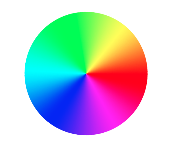
Choosing Colors
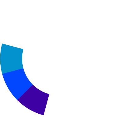
Complementary vs. Triadic vs. Split Complementary vs. Analogous
-
Color Wheel
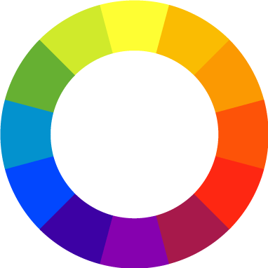
-
Complementary

-
Triadic
-
Split Complementary
-
Analogous
Choosing Colors
But...have you ever seen a website that looks good and has only these colors?
Choosing Colors
Color Palette Guidelines
Choose:
- a base color
- an accent color
- a super light neutral
- a super dark neutral
- a mid-level intensity neutral
Choosing Colors
-
#5DBA3B
-
#AC4CC1
-
#ffffff
-
#081105
-
#939E98
Choosing Colors
Tools to Choose Colors
Choosing Colors
Utilize color to maximize conversion.
Choosing Colors
Use accent colors to draw attention.
Choosing Colors
Test continually!
Choosing Colors
There is an evolutionary basis for the psychological responses we have to color.
Always remember: perception of color is personal!
Where to Learn More
Articles and Resources
- How to Meet Web Content Accessibility Guidelines 2.0
- A Simple Web Developer's Guide to Color, by Laura Elizabeth in Smashing Magazine
- Design Accessibly, See Differently: Color Contrast Tips And Tools, by Cathy O'Connor in Smashing Magazine
- Designing with Hue Saturation and Lightness, by Ryan Allen
CMYK Conversion Tools
- Color picker in Photoshop or Illustrator
- Online conversion tool like Rapid Tables
Pantone Conversion Tools
Tools to Test Color Accessibility
- NoCoffee Vision Simulator (Chrome Extension)
- Coblis Color Blindness Simulator
- Sim Daltonism (iOS and Mac only)
- PhotoShop has a built in color-blindness simulator.
Tools to Test Contrast Accessibility
- WebAIM Color Contrast Checker
- WAVE Web Accessibility Evaluation Tool
- Jonathan Snook's Colour Contrast Check
Tools to Choose Colors
Thank you!
http://bethsoderberg.com/slides/2016/wordcamp-dc/index.html#/