Post Title
9/17Blurb about post here.
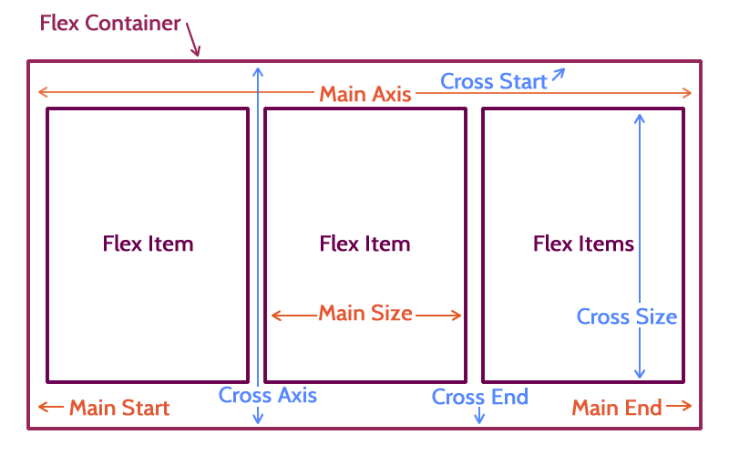
column and it's related column-* propertiesclearfloatvertical-align
display: flex;
display: inline-flex;
* Vendor prefixing for this property is added to the flex property itself, not the display attribute. For example: display: -webkit-flex.
    content
    content
    content
p {
    border: 5px solid #ffffff;
    margin-bottom: 0;
    box-sizing: border-box;
}
“That which yields is not always weak.”
― Jacqueline Carey
“Agile does not mean laissez-faire, flexibility and freedom are based on the well-defined principles.”
― Pearl Zhu
“The measure of intelligence is the ability to change.”
― Albert Einstein
div { display: flex; }
“That which yields is not always weak.”
― Jacqueline Carey
“Agile does not mean laissez-faire, flexibility and freedom are based on the well-defined principles.”
― Pearl Zhu
“The measure of intelligence is the ability to change.”
― Albert Einstein
* The default flex-direction is row.
div { flex-direction: row-reverse; }
“That which yields is not always weak.”
― Jacqueline Carey
“Agile does not mean laissez-faire, flexibility and freedom are based on the well-defined principles.”
― Pearl Zhu
“The measure of intelligence is the ability to change.”
― Albert Einstein
div { flex-direction: column; }
“That which yields is not always weak.”
― Jacqueline Carey
“Agile does not mean laissez-faire, flexibility and freedom are based on the well-defined principles.”
― Pearl Zhu
“The measure of intelligence is the ability to change.”
― Albert Einstein
div { flex-direction: column-reverse; }
“That which yields is not always weak.”
― Jacqueline Carey
“Agile does not mean laissez-faire, flexibility and freedom are based on the well-defined principles.”
― Pearl Zhu
“The measure of intelligence is the ability to change.”
― Albert Einstein
p:first-child {
  order: 3;
}

p:nth-child(2) {
  order: 1;
}
p:nth-child(2) {
  order: 2;
}}
“That which yields is not always weak.”
― Jacqueline Carey
“Agile does not mean laissez-faire, flexibility and freedom are based on the well-defined principles.”
― Pearl Zhu
“The measure of intelligence is the ability to change.”
― Albert Einstein
p { width: 33.333%; }
“That which yields is not always weak.”
― Jacqueline Carey
“Agile does not mean laissez-faire, flexibility and freedom are based on the well-defined principles.”
― Pearl Zhu
“The measure of intelligence is the ability to change.”
― Albert Einstein
p { width: 50%; }
“That which yields is not always weak.”
― Jacqueline Carey
“Agile does not mean laissez-faire, flexibility and freedom are based on the well-defined principles.”
― Pearl Zhu
“The measure of intelligence is the ability to change.”
― Albert Einstein
div { flex-wrap: wrap; }
p { width: 50%; }
“That which yields is not always weak.”
― Jacqueline Carey
“Agile does not mean laissez-faire, flexibility and freedom are based on the well-defined principles.”
― Pearl Zhu
“The measure of intelligence is the ability to change.”
― Albert Einstein
div { flex-wrap: wrap-reverse; }
p { width: 50%; }
“That which yields is not always weak.”
― Jacqueline Carey
“Agile does not mean laissez-faire, flexibility and freedom are based on the well-defined principles.”
― Pearl Zhu
“The measure of intelligence is the ability to change.”
― Albert Einstein
div { flex-flow: wrap; }
p { width: 50%; }
“That which yields is not always weak.”
― Jacqueline Carey
“Agile does not mean laissez-faire, flexibility and freedom are based on the well-defined principles.”
― Pearl Zhu
“The measure of intelligence is the ability to change.”
― Albert Einstein
* flex-flow is a shorthand property for flex-direction and flex-wrap. Detailed information on its syntax is available from the Mozilla Developer Network.
p { flex: 1; }
“That which yields is not always weak.”
― Jacqueline Carey
“Agile does not mean laissez-faire, flexibility and freedom are based on the well-defined principles.”
― Pearl Zhu
“The measure of intelligence is the ability to change.”
― Albert Einstein
* flex is a shorthand property for flex: flex-grow flex-shrink flex-basis;.
p { flex-basis: 0; }
1
2
3
p { flex-basis: 150px; }
1
2
3
p { flex-basis: 33.33333%; }
1
2
3
p { flex-grow: 0; flex-basis: 150px; }
1
2
3
p { flex-grow: 1; flex-basis: 150px;}
1
2
3
p { flex-basis: 150px; }
p:first-child { flex-grow: 1; }
p:nth-child(2) { flex-grow: 3; }
p:nth-child(3) { flex-grow: 2; }
1
2
3
p { flex-basis: 0; }
p:first-child { flex-grow: 1; }
p:nth-child(2) { flex-grow: 3; }
p:nth-child(3) { flex-grow: 2; }
1
2
3
p {
    flex-grow: 1;
    flex-shrink: 1;
    flex-basis: 150px;
}
1
2
3
div { width: 600px; }
p { flex-grow: 1; flex-shrink: 1; flex-basis: 150px; }
p:first-child { flex-shrink: 2; }
1
2
3
div { width: 300px; }
p { flex-grow: 1; flex-shrink: 1; flex-basis: 150px; }
p:first-child { flex-shrink: 2; }
1
2
3
flex: 1;
is the same as
flex: 1 1 0;
flex-grow: defaults to 1 when omittedflex-shrink: defaults to 1 when omittedflex-basis: defaults to 0 when omitted* Detailed information on the syntax of the flex shorthand property is available from the Mozilla Developer Network.
1
2
3
div { justify-content: center; }
1
2
3
div { justify-content: space-between; }
1
2
3
div { justify-content: space-around; }
1
2
3
p { justify-content: flex-start; }
1
2
3
p { justify-content: flex-end; }
1
2
3
Base example code:
div { flex-wrap: wrap; }
p { width: 50%; }
Two
Lines
One Line
Three
Lines
Three
Four
Lines
Four
Lines
div { align-items: center; }
Two
Lines
One Line
Three
Lines
Three
Four
Lines
Four
Lines
div { align-items: flex-end; }
Two
Lines
One Line
Three
Lines
Three
Four
Lines
Four
Lines
* For all possible align-items values reference the Mozilla Developer Network documentation.
div { align-items: flex-end; }
p:nth-child(3) {
    align-self: flex-start;
}
Two
Lines
One Line
Three
Lines
Three
Four
Lines
Four
Lines
* For all possible align-self values reference the Mozilla Developer Network documentation.
Base example code:
div { height: 300px; background: #982733; }
p { height: 70px; }
1
2
3
4
div { align-content: center; }
1
2
3
4
div { align-content: space-between; }
1
2
3
4
Flexbox is supported in
And needs -webkit- and kinda needs -moz- vendor prefixes.
Still... test ALL THE THINGS!
div { align-items: center; justify-content: center; }
Look, I'm centered!
ul { display: flex; }
ul li { flex: 1; }
ul.navlist li a { width: 100%; display: block; }
Post Title
9/17
Blurb about post here.
Blurb about post here.
.post {
    display: flex;
    flex-direction: column;
}
h2 { order: 3; }
span.date { order: 1; }
p { order: 4; }
ul.tags { order: 2; }
Blurb about post here.
div { justify-content: space-between; }
p { width: 30%; }
“That which yields is not always weak.”
― Jacqueline Carey
“Agile does not mean laissez-faire, flexibility and freedom are based on the well-defined principles.”
― Pearl Zhu
“The measure of intelligence is the ability to change.”
― Albert Einstein
< body>
...
...
< /body>
body {
    display: flex;
    min-height: 100vh;
    flex-direction: column;
}

main {
    flex: 1;
}
header content
main content
header content
main content
Lorem ipsum dolor sit amet, consectetur adipiscing elit. Suspendisse tincidunt aliquam nisl, eget ullamcorper enim auctor non.
Lorem ipsum dolor sit amet, consectetur adipiscing elit. Suspendisse tincidunt aliquam nisl, eget ullamcorper enim auctor non.
Lorem ipsum dolor sit amet, consectetur adipiscing elit. Suspendisse tincidunt aliquam nisl, eget ullamcorper enim auctor non.
Lorem ipsum dolor sit amet, consectetur adipiscing elit. Suspendisse tincidunt aliquam nisl, eget ullamcorper enim auctor non.
Lorem ipsum dolor sit amet, consectetur adipiscing elit. Suspendisse tincidunt aliquam nisl, eget ullamcorper enim auctor non.
Lorem ipsum dolor sit amet, consectetur adipiscing elit. Suspendisse tincidunt aliquam nisl, eget ullamcorper enim auctor non.
-
headline
content
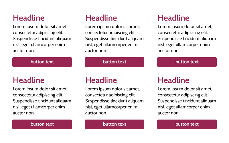
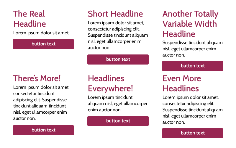
ul {
  display: flex;
  flex-flow: wrap;
  list-style: none;
  justify-content: space-between;
}

ul li {
  width: 30%;
  display: flex;
  flex-direction: column;
}

ul p {
  flex-grow: 1;
}
Lorem ipsum dolor sit amet.
Lorem ipsum dolor sit amet, consectetur adipiscing elit. Suspendisse tincidunt aliquam nisl, eget ullamcorper enim auctor non.
Suspendisse tincidunt aliquam nisl, eget ullamcorper enim auctor non.
Lorem ipsum dolor sit amet, consectetur tincidunt adipiscing elit. Suspendisse tincidunt aliquam tincidunt nisl, eget ullamcorper enim auctor non.
Lorem ipsum tincidunt aliquam nisl, eget ullamcorper enim auctor non.
Lorem ipsum dolor sit amet, consectetur adipiscing elit. Suspendisse tincidunt aliquam nisl, eget ullamcorper enim auctor non.
http://bethsoderberg.com/slides/2016/wordcamp-pittsburgh/index.html#/