Sass Isn't Scary
WordCamp Baltimore 2017
What is CSS again?
Cascading Style Sheets are made up of:
- Selectors
- Properties
- Values
...and are governed by the cascading algorithm.
	selector {
		property: value;
		property: value;
	}
We're expected to style
ALL THE THINGS
using these tools
All the things:
- Screen widths
- Screen resolutions
- Templates/Variations within site
- Other things too
CSS Goals:
- Consistency
- Performativity
That’s a lot to keep track of in one file...
Enter CSS preprocessors!
A preprocessor is a language that compiles to another language.
Preprocessors bring programmatic methodology to CSS.
- DRY: Don’t Repeat Yourself
- Reusable libraries
- Ability to define abstract values
CSS preprocessors are NOT CSS.
CSS preprocessors don’t have to follow CSS specification rules.
Benefits
Benefits
Programmability
Benefits
Automation
Benefits
Modularity
Benefits
Programmability + Automation + Modularity = Scalability
Potential Challenges
Challenges
Fear of Change
Challenges
Set Up
Challenges
Debugging
Challenges
Bloat
Challenges
Maintainability
Why Sass?
- Work team preference
- WordPress community preference
- Accessibly written books/resources
What about Less?
Syntactically Awesome Stylesheets (Sass)
Basics
Sass is an extension of CSS that adds power and elegance to the basic language. It allows you to use variables, nested rules, mixins, inline imports, and more, all with a fully CSS-compatible syntax. Sass helps keep large stylesheets well-organized, and get small stylesheets up and running quickly, particularly with the help of the Compass style library.
Basics
Sass vs. Scss
.sass
	h1
		font-size: 30px
		line-height: 36px
		color: #ca0164

	p
		font-size: 18px
		line-height: 24px
		color: #333
.scss
	h1 {
		font-size: 30px;
		line-height: 36px;
		color: #ca0164;
	}

	p {
		font-size: 18px;
		line-height: 24px;
		color: #333;
	}
Basics
This presentation (and almost all of my projects) use the .scss syntax.
Basics
Learn Sass slowly by relying on what you know about CSS.
Nesting
Nesting
.scss
.site-header {
	background: #efefef;
	margin-bottom: 65px;

	.header-wrap {
		padding: 28px 100px;
		max-width: 1200px;
		margin: 0 auto;
	}

	.site-title {
		max-width: 85px;
	}
}
Compiled CSS
.site-header {
	background: #efefef;
	margin-bottom: 65px;
}

.site-header .header-wrap {
	padding: 28px 100px;
	max-width: 1200px;
	margin: 0 auto;
}

.site-header .site-title {
	max-width: 85px;
}
Nesting
Benefits
- Avoids duplicating selectors
- Reflects markup structure
- Uses indentation to indicate hierarchy
- Should be limited to 4-5 levels
- Less typing!
Nesting
Nesting Properties with Shared Namespaces
Nesting
Shared Namespace: font-
.scss
p {
	font: {
		size: 18px;
		family: Arial, sans-serif;
		weight: 400;
	}
	color: #333;
	margin: 0 0 20px;
}
Compiled CSS
p {
	font-size: 18px;
	font-family: Arial, sans-serif;
	font-weight: 400;
	color: #333;
	margin: 0 0 20px;
}
Nesting
Shared Namespace: background-
.scss
.hero {
	background: {
		color: #eaeaea;
		size: cover;
		image: url("img.png");
		repeat: no-repeat;
		position: center;
	}
}
Compiled CSS
.hero {
	background-color: #eaeaea;
	background-size: cover;
	background-image: url("img.png");
	background-repeat: no-repeat;
	background-position: center;
}
Nesting
Referencing Nested Parent Selectors
& is a special character in Sass that references the parent selector of a nested item.
Nesting
Referencing Parent Selectors for Link States
.scss
a {
	font-weight: 700;
	color: purple;
	text-decoration: none;
	border-bottom: 3px solid purple;
	&:hover {
		color: blue;
		border-color: blue;
	}
	&.alert {
		color: red;
		border-color: red;
	}
}
Compiled CSS
a {
	font-weight: 700;
	color: purple;
	text-decoration: none;
	border-bottom: 3px solid purple;
}

a:hover {
	color: blue;
	border-color: blue;
}

a.alert {
	color: red;
	border-color: red;
}
Nesting
Media Queries: .scss
	.header-wrap {
		padding: 28px 100px;
		max-width: 1200px;
		margin: 0 auto;

		@media screen and (max-width: 1199px) {
			padding: 22px 60px;
		}

		@media screen and (max-width: 769px) {
			padding: 16px 40px;
		}

		@media screen and (max-width: 450px) {
			padding: 12px 30px;
		}
	}
Nesting
Media Queries: Compiled CSS
	.header-wrap {
		padding: 28px 100px;
		max-width: 1200px;
		margin: 0 auto;
	}

	@media screen and (max-width: 1199px) {
		.header-wrap {
			padding: 22px 60px;
		}
	}

	@media screen and (max-width: 769px) {
		.header-wrap {
			padding: 16px 40px;
		}
	}

	@media screen and (max-width: 450px) {
		.header-wrap {
			padding: 12px 30px;
		}
	}
Variables
Allow defining values once for use throughout a style sheet.
Variables
Defining Variables
	/* colors */
	$dark: #333;
	$light: #e9e9e9;
	$accent: #ca0164;

	/* fonts */
	$serif: Georgia, serif;
	$sans: Arial, sans-serif;
	$mono: "Courier New", monospace, sans-serif;

	/* font weights */
	$light: 200;
	$reg: 400;
	$bold: 700;
Variables
Invoking Variables
.scss
p {
	font: {
		size: 18px;
		family: $sans;
		weight: $reg;
	}
	color: $dark;
	margin: 0 0 20px;
}
Compiled CSS
p {
	font-size: 18px;
	font-family: Arial, sans-serif;
	font-weight: 400;
	color: #333;
	margin: 0 0 20px;
}
Variables
Good uses for variables:
- Colors
- Font stacks
- Image paths
- Margin
- Widths
- Font sizes
Variables
There are proposals to add variables to the CSS specification, but nothing usable exists yet.
Mixins
- Allows defining a group of styles once for use throughout a style sheet.
- Should be used for common patterns independent of HTML markup.
- 80% of mixins have less than 5 declarations.
Mixins
Defining Mixins
	/* Displays as block element and centers it */
	@mixin center-block {
		display: block;
		margin-left: auto;
		margin-right: auto;
	}

	/* Defines base style for headlines */
	@mixin headline {
		font: {
			size: 22px;
			family: $serif;
			weight: bold;
		}
	  	text-transform: uppercase;
	  	margin: 0 0 20px;
	}
Mixins
Invoking Mixins
.scss
h2 {
	@include center-block;
	@include headline;
	color: $accent;
}

h3 {
	@include headline;
	color: $dark;
}
Compiled CSS
h2 {
	display: block;
	margin-left: auto;
	margin-right: auto;
	font-size: 22px;
	font-family: $serif;
	font-weight: bold;
  	text-transform: uppercase;
  	margin: 0 0 20px;
	color: #ca0164;
}

h3 {
	font-size: 22px;
	font-family: $serif;
	font-weight: bold;
	text-transform: uppercase;
	color: #333;
}
Mixins
Arguments with Mixins
	/* Defines base style for headlines */
	@mixin headline($color) {
		font: {
			size: 22px;
			family: $serif;
			weight: bold;
		}
		color: $color;
	  	text-transform: uppercase;
	  	margin: 0 0 20px;
	}
Mixins
Invoking a Mixin with an Argument
.scss
h2 {
	@include center-block;
	@include headline($accent);
}

h3 {
	@include headline($dark);
}
Compiled CSS
h2 {
	display: block;
	margin-left: auto;
	margin-right: auto;
	font-size: 22px;
	font-family: $serif;
	font-weight: bold;
  	text-transform: uppercase;
  	margin: 0 0 20px;
	color: #ca0164;
}

h3 {
	font-size: 22px;
	font-family: $serif;
	font-weight: bold;
	text-transform: uppercase;
	color: #333;
}
Mixins
Mixins are perfect for storing browser prefixes.
	/* browser prefix for displaying flexbox */
	@mixin flex {
		display: -webkit-flex;
		display: flex;
	}

	/* browser prefix for border-radius */
	@mixin radius($number) {
		-webkit-border-radius: $number;
		-moz-border-radius: $number;
		border-radius: $number;
	}
Note: border-radius has 95% support without prefixes and doesn't really require them anymore, it's just a great classic example of how to use mixins to your advantage.
Mixins
Mixin Libraries
Write your most common mixins once and reuse across projects.
- Write your own
- Compass
- Bourbon
- Sass CSS3 Mixins
- Breakpoint
- Google for more!
Operators
Sass supports standard math operators like:
- +
- -
- *
- /
- %
Operators
Your code will do math for you.
.scss
.container {
	width: 100%;
}

section.main {
  float: left;
  width: 600px / 960px * 100%;
}

section.sidebar {
  float: right;
  width: 300px / 960px * 100%;
}
Compiled CSS
.container {
  width: 100%;
}

section.main {
  float: left;
  width: 62.5%;
}

section.sidebar {
  float: right;
  width: 31.25%;
}
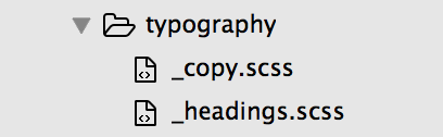
Partials
- An underscore-prefixed Sass file is a partial.
- Don't generate CSS files directly
- @import pulls partials into .scss files, which compile to CSS
- Modularization without extra HTTP requests!
Partials
Partials
The .scss file importing our partials would contain:
	@import "typography/copy";
	@import "typography/headings";
Comments
- Standard CSS comment syntax still works!
- Supports comments that won't compile into output.
Comments
.scss
	/* This is a multi-line comment that will compile to the CSS output. */

	// This is a single-line comment that will not compile to the CSS output.
Compiled CSS
/* This is a multi-line comment that will compile to the CSS output. */
Installation
Installation
Install Ruby
- Windows: Ruby Installer
- Mac: already installed
- Linux: apt-get install ruby
Installation
Install via Command Line
gem install sassIf that doesn't work...
sudo gem install sassInstallation
Install via Application
- Codekit (M)
- Compass.app (M, W, L)
- Ghostlab (M, W)
- Hammer (M)
- Koala (M, W, L)
- LiveReload (M, W)
- Prepros (M, W, L)
- Scout-App (M, W, L)
M = Mac; W = Windows; L = Linux
Compiling
Compiling
Via Sass
sass --watch [path]Compiling
Via Compass
Install
gem install compassRun
cd /your/project/pathcompass watchSetting Up Themes
Setting Up Themes
New Projects Using Underscores
- underscores.me
- Choose _sassify! option when generating theme
- Default CSS is in .scss partials
- You need to decide how to compile - for Compass, add config.rb at root
Setting Up Themes
New Projects Using Another Theme
- Make a child theme.
- Add sass folder at root of child theme.
- Put partials in your sass folder and move CSS into them.
- Set up style.scss and @input all partials into it.
- Account for way to compile.
Setting Up Themes
Old Projects
- The same as starting a project with a base theme that has not accounted for a preprocessor.
- Child theme guidelines may not apply.
And so . . .
Take one step at a time.
You can totally do this!
Thank you!
Learning Resources
Sass
Compass
Books
- Sass for Web Designers, by Dan Cederholm
- Sass and Compass in Action, by Wynn Netherland, Nathan Weizenbaum, Chris Eppstein, and Brandon Mathis